
Elevate

Designing an intuitive gym app that encourages community.
Lead Designer
I took responsibility of the end-to-end design of the product. I defined the core concepts and solution approaches to key user and business problems, translating them into clear, scalable experiences. I also headed up the brand direction of Elevate. This included shaping the product vision, creating user flows and interaction models, and designing all UX and UI outputsfrom early concepts and prototypes through to production-ready designs while ensuring consistency, usability, and alignment with Elevate’s goals.
MY ROLE
COMPETITOR ANALYSIS
LEAD DESIGNER
ICONOGRAPHY
DISCOVERY
BRANDING
PROTO-TYPING
PRODUCT DELIVERY
DESIGN SYSTEMS
SURVEYS
LIVE INTERVIEWS


Project focus
Make it human
How do we make the app useable? By addressing real needs. It wasn’t about just making the app look pretty, it was about designing an app that really answered a problem.
Clear and simple flow
The flow must make sense. Understanding user needs, then designing a thoroughly revised user journey, helps this process happen smoother.
Branding
Join the vision/direction and add to it. I wanted to create a compelling narrative that drew in stakeholders and team members. Making it aesthetically pleasing would come naturally.
Recognise pain points
Through iterations, meetings with Devs and Stakeholders, multiple live interviews and testing and creative solutions I was able to design an app that was easy to use.

Outcomes
Increase in user activation (23%)
Reduced onboarding steps by removing non-essential inputs, Introduced guided actions and visual progress cues that sped up the process and made it more comfortable for users to start. All of this led to a 23% uplift in user activation within the first few weeks post-launch.
Increase in useage
Design improvements to Elevate led to a measurable increase in session frequency and average session duration as users found clearer reasons to return and spend time in the app.
Step One: UX/UI
DISCOVERY: SURVEY & INTERVIEWS
I Surveyed (15) Target users and conducted (5) In depth user interviews, using Microsoft teams and Survey Monkey, to understand what truly makes a gym app feel like more than just a workout tracker. We found themes such as motivation, accountability, and a sense of belonging. Features like social challenges, progress-sharing, and personalized check-ins emerged as key ways to foster connection. Our survey focused on demographics, attitudes towards using social-media, Lifestyle habits, tool research habits and current challenges.
The user interviews allowed us to define the consideration set for the comparative analysis.
COMPARITIVE ANALYSIS & COMPETITIVE MARKET STUDIES
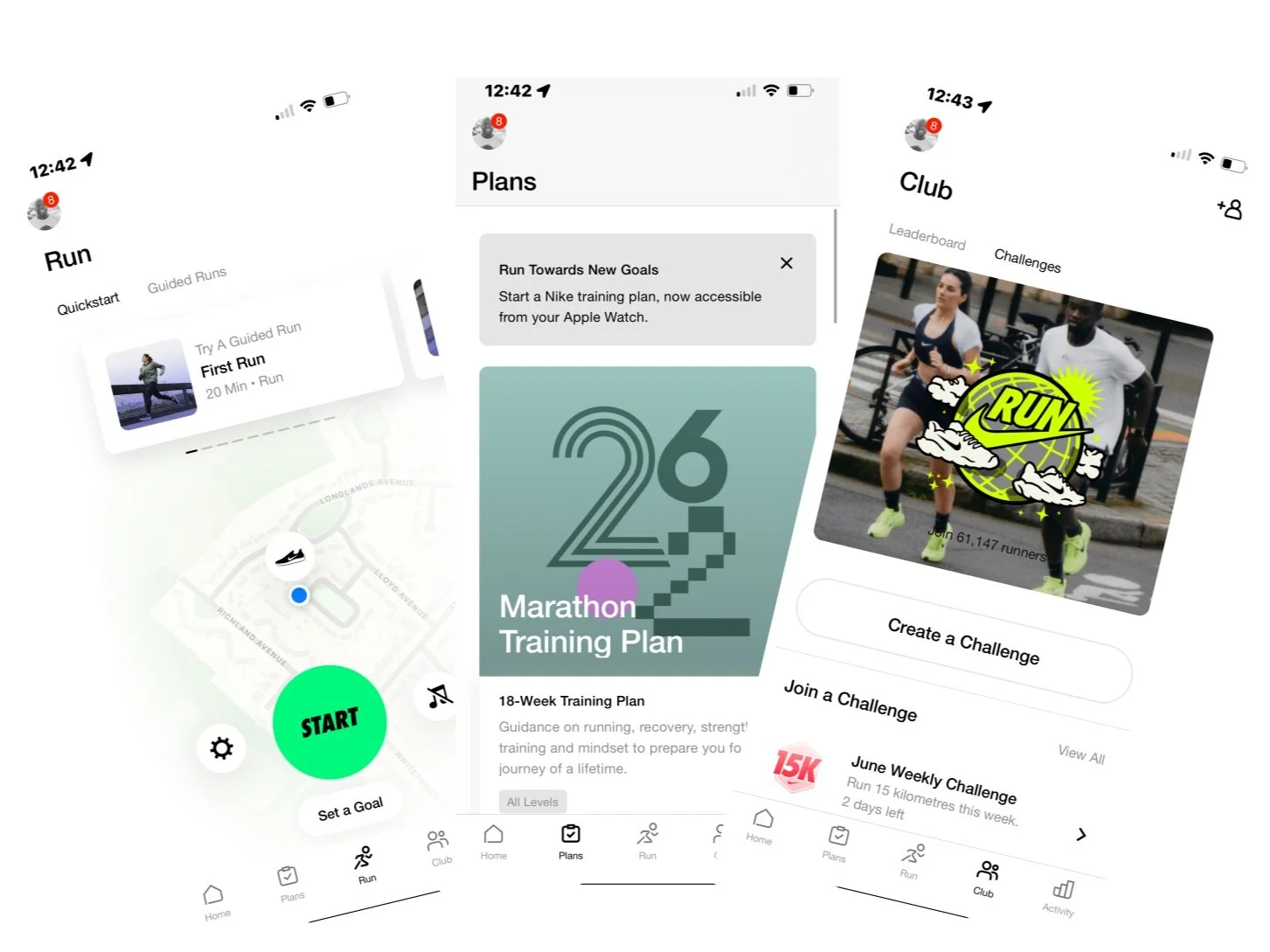
To gain industry wide context for best practices and opportunities for differential advantage I conducted a survey of (2) industry competitors and what I deemed as successful landing page references. In this study I researched what makes these competitors effective. Key factors such as Navigation, Social Proof, Scannability, AND CTA’s. Key design insights gained: Repeated CTA’s, Concise Text, White Space, Distinct content blocks and responsive iOS design.
PUREGYM

NIKE RUNNING APP
AFFINITY MAPPING & USER PERSONAS
I synthesised data from our survey and interviews with affinity mapping using Miro. Grouping together similar responses and keywords to pinpoint trends and outliers allowing me to prioritise our users’ needs. After synthesizing the data I created (3) user personas and scenarios to support clear communication during the design process. The 3 archetypes identified were the Stay at home mum, the married father working full time, young professionals working within large enterprises.

USER JOURNEY
Next steps involved designing a user journey for Elevate. It was imperative at this point that I set up meetings with developers to potentially find technical opportunities or blockers. We were able to identify key needs like accountability, social connection, and class accessibility while addressing pain points such as scheduling conflicts.

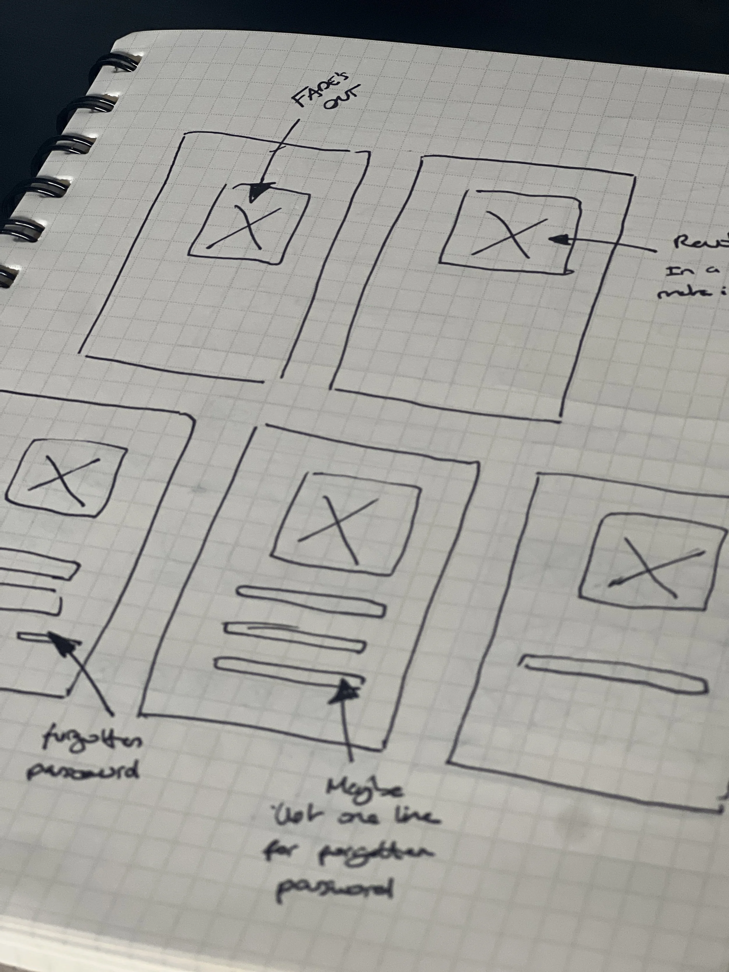
LOW FIDELITY MOCK-UPS
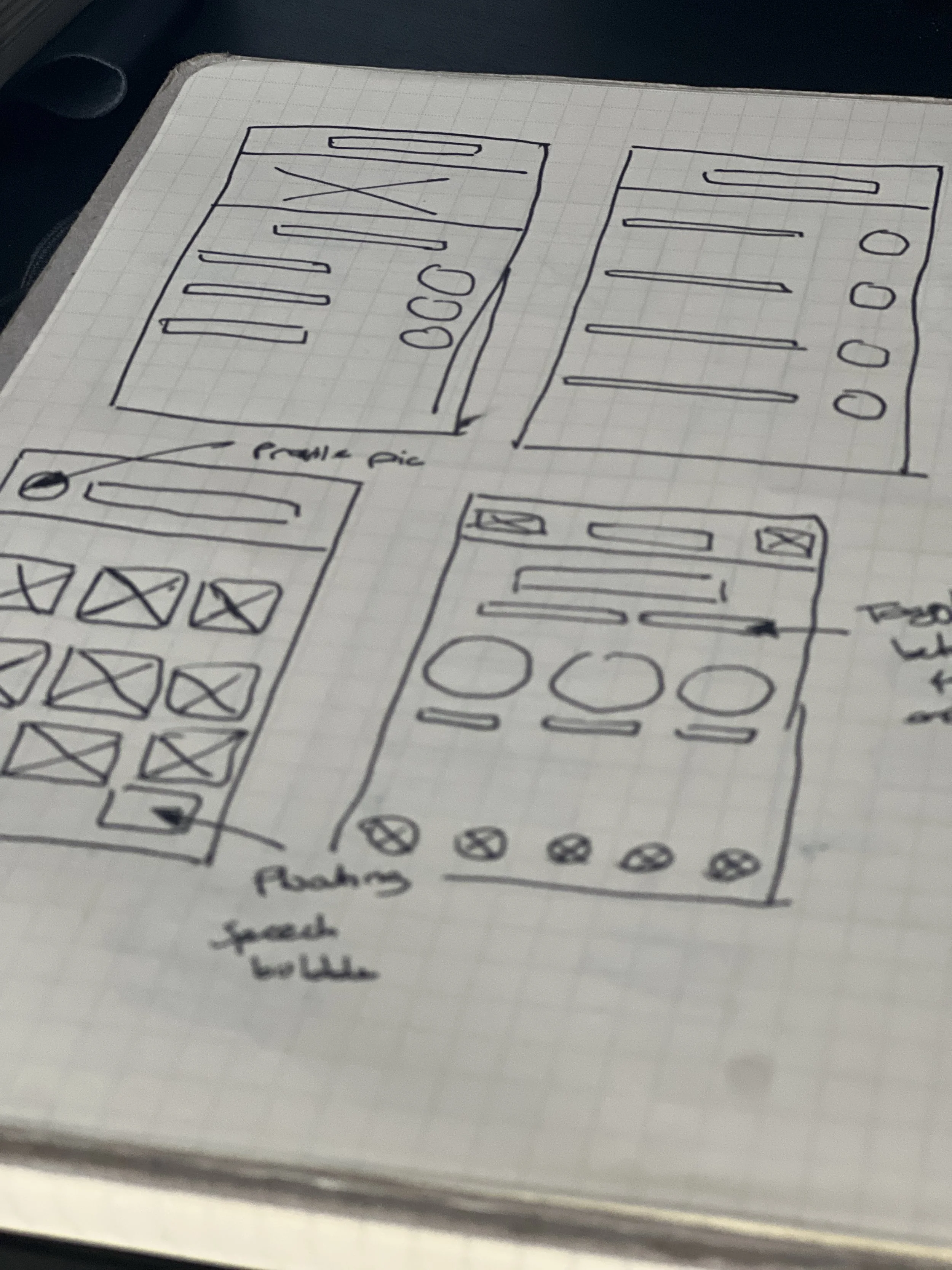
MID FIDELITY MOCK-UPS
Using Figma, I turned the paper prototypes into a live digital wireframe and used this to conduct 4 usability interviews. I highlighted some of the pain points, and took them into careful consideration when designing the high fidelity mock ups. These were some of the issues that arose. As we had already brought Devs into meetings we had no complications or constraints moving forward.
PAIN POINTS
Potential scheduling conflicts: Making sure we designed clear notice screens to advise for next steps.
Privacy and comfort concerns: Users hesitant to share progress, photos with strangers. I had to design privacy settings, which allowed users to choose who could see their personal pages.
Overwhelming onboarding: Too much information, especially on the “Trophies” Page. Had to scale down what we presented to users.


Step Two: BRANDING
FINALS
After researching popular fitness apps, I found a theme around thick lettering, quirky suggestions within the logo and positive colouring. With the branding completed, UI would now be seamless as I could implement it into the app.


: 00534F


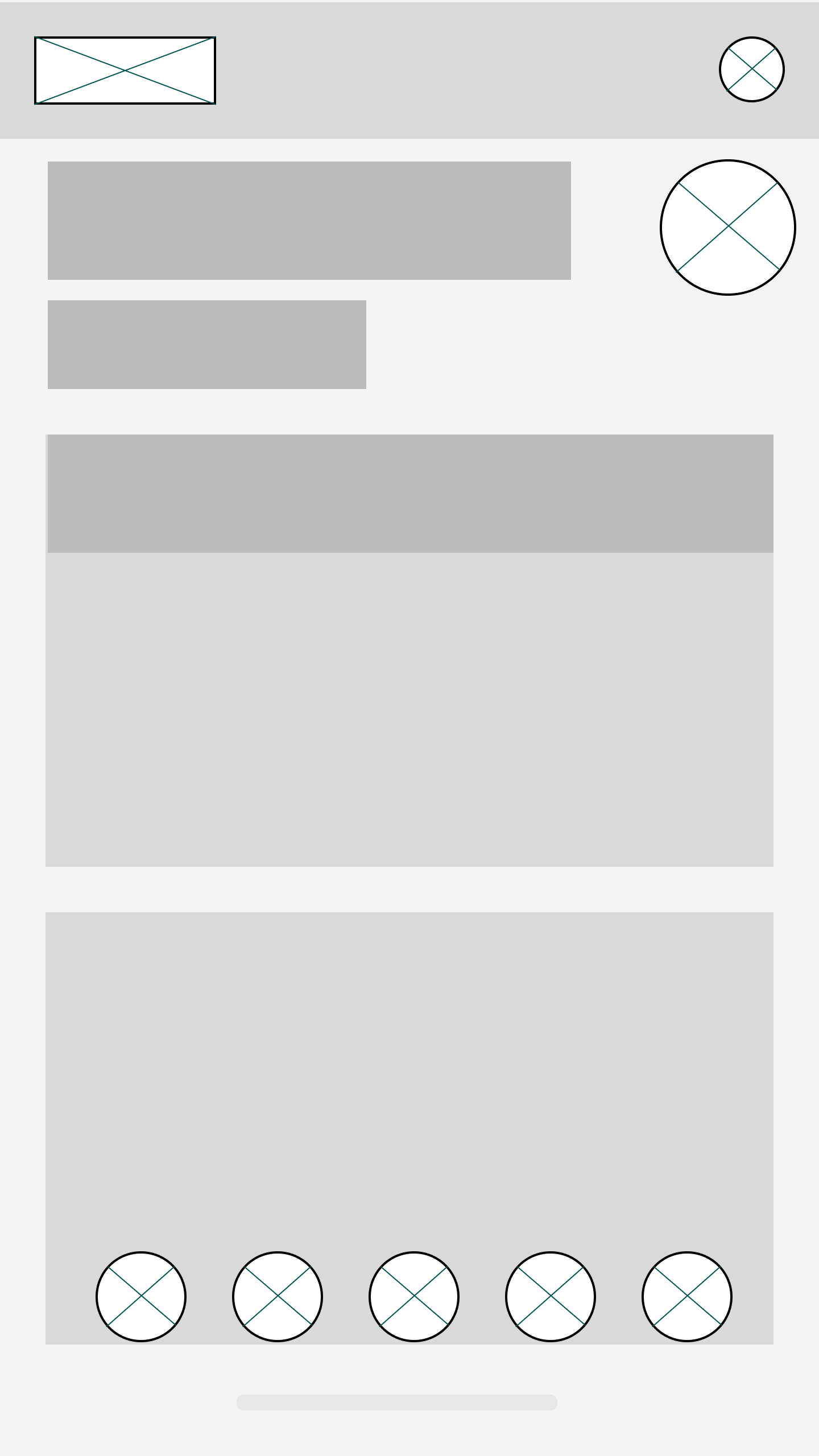
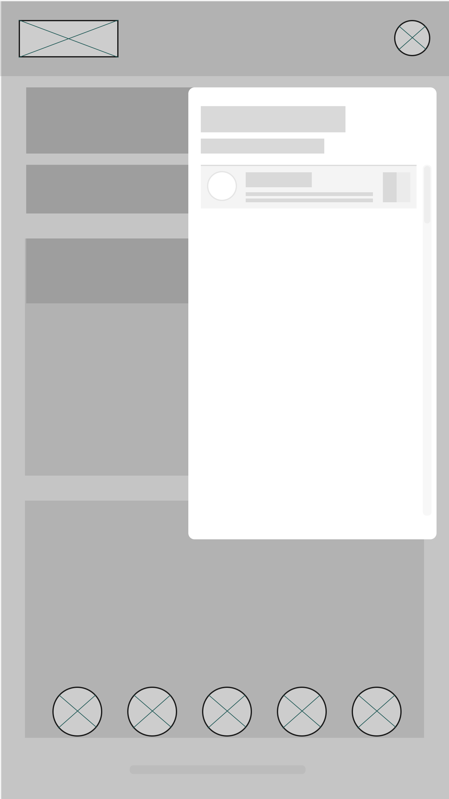
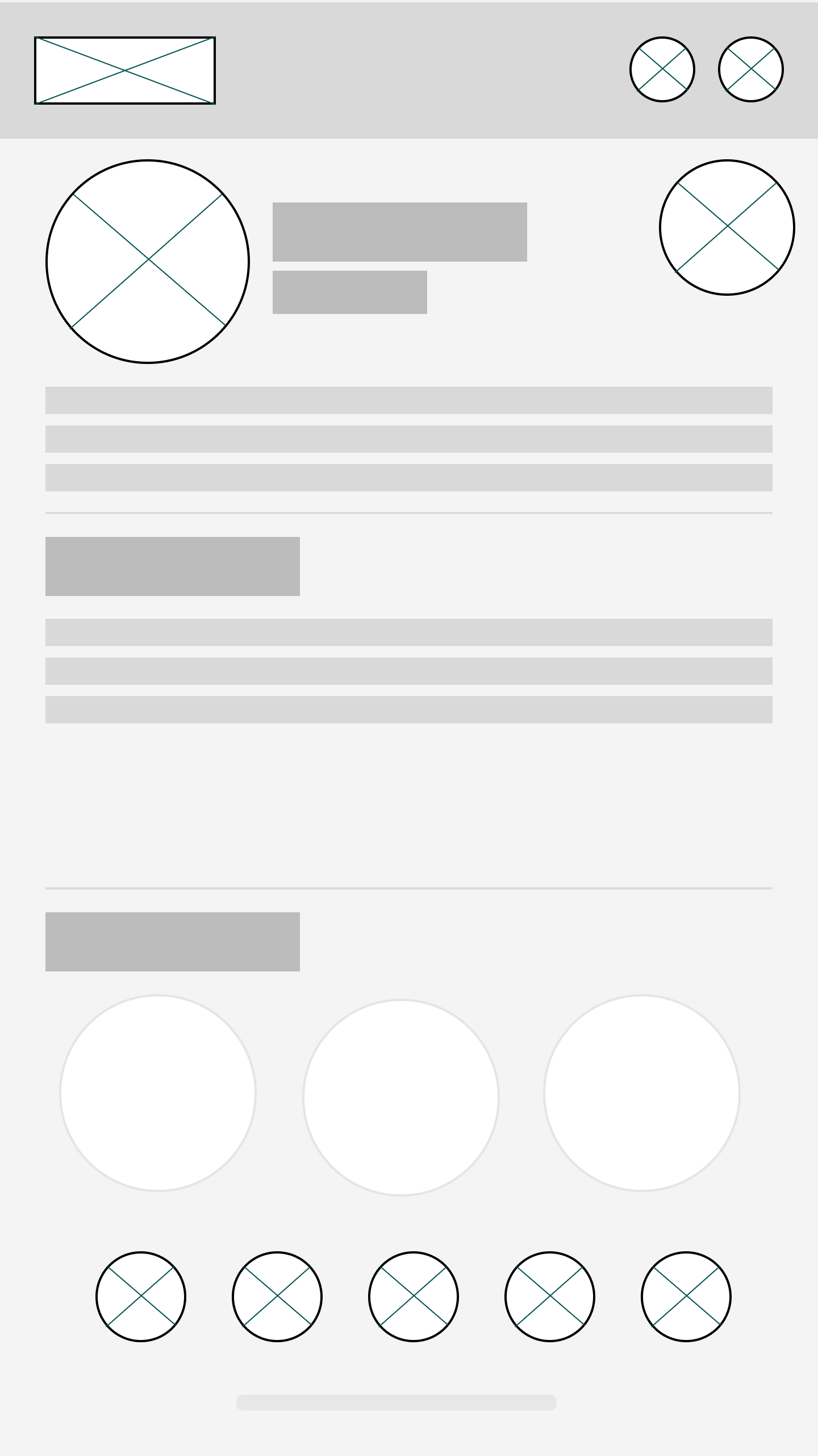
HIGH FIDELITY MOCK UPS


Want to work together?
Let’s see what we can design :)