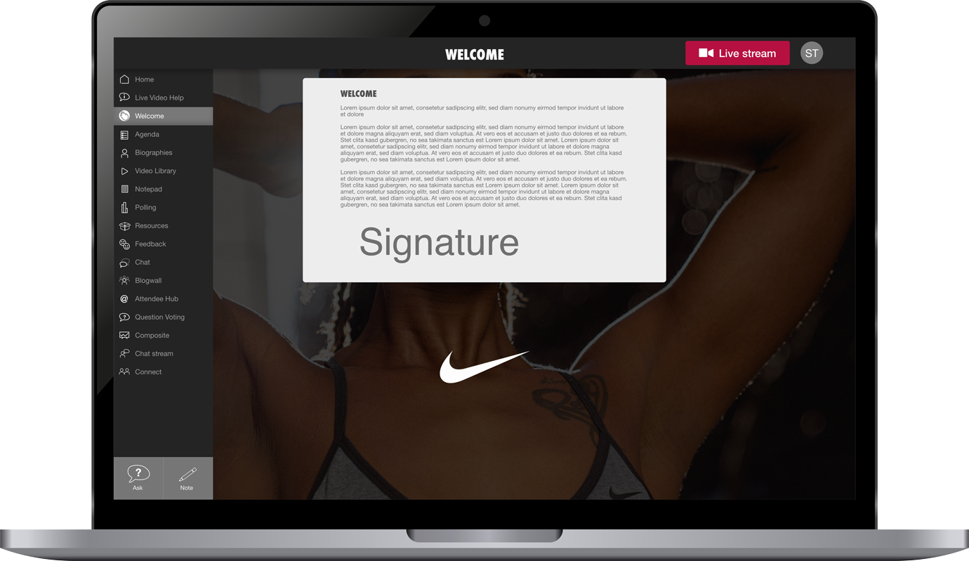
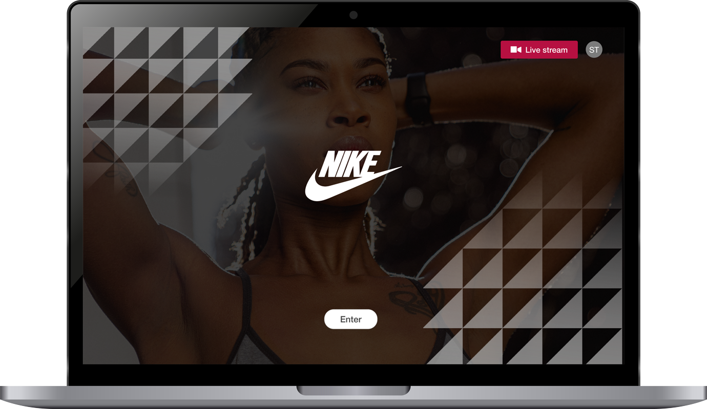
ELEVATE

ROLE

UX Designer

TIMELINE

5 Day Sprint

BRIEF

Create a brand identity and iOS Mobile app for Elevate, a community focused gym with that connects members.

TOOLS USED

Figma

Adobe Suite

User personas

Rapid prototyping

Branding

Affinity mapping

Step One: UX

DISCOVERY: SURVEY & INTERVIEWS

I Surveyed (15) Target users and conducted (5) In depth user interviews to understand what truly makes a gym app feel like more than just a workout tracker. They want motivation, accountability, and a sense of belonging. Features like social challenges, progress-sharing, and personalized check-ins emerged as key ways to foster connection. Our survey focused on demographics, attitudes towards using social-media, Lifestyle habits, tool research habits and current challenges.

The user interviews allowed us to define the consideration set for the comparative analysis.

COMPARITIVE ANALYSIS & COMPETITIVE MARKET STUDIES

To gain industry wide context for best practices and opportunities for differential advantage I conducted a survey of (2) industry competitors and what I deemed as successful landing page references.

 In this study I researched what makes these competitors effective. Key factors such as Navigation, Social Proof, Scannability, AND CTA’s

​Key design insights gained: Repeated CTA’s, Concise Text, White Space, Distinct content blocks and responsive iOS design.

PUREGYM

NIKE RUNNING APP

AFFINITY MAPPING

I synthesised data from our survey and interviews with affinity mapping. Grouping together similar responses and keywords to pinpoint trends and outliers allowing me to prioritise our users’ needs.

USER PERSONAS

After synthesizing the data I created (3) user personas and scenarios to support clear communication during the design process. The 3 archetypes identified were the Stay at home mum, the married father working full time, young professionals working within large enterprises.

USER JOURNEY

Next steps involved designing a user journey for Elevate. It helps identify key user needs—like accountability, social connection, and class accessibility—while addressing pain points such as scheduling conflicts or loss of motivation. By mapping out the journey, I can create a seamless experience that keeps users engaged, whether through personalised class recommendations, social challenges, or timely reminders.

LOW FIDELITY MOCK-UPS

MID FIDELITY MOCK-UPS

Using Figma, I turned the paper prototypes into a live digital wireframe and used this to conduct 4 usability interviews. I highlighted some of the pain points, and took them into careful consideration when designing the high fidelity mock ups. These were some of the issues that arose.

PAIN POINTS

  • Potential scheduling conflicts: Making sure we designed clear notice screens to advise for next steps.

  • Privacy and comfort concerns: Users hesitant to share progress, photos with strangers. I had to design privacy settings, which allowed users to choose who could see their personal pages.

  • Overwhelming onboarding: Too much information, especially on the “Trophies” Page. Had to scale down what we presented to users.

Step Two: BRANDING

FINALS

After researching popular fitness apps, I found a theme around thick lettering, quirky suggestions within the logo and positive colouring. With the branding completed, UI would now be seamless as I could implement it into the app.

: 00534F

HIGH FIDELITY MOCK UPS

Like what you see? Contact me here