

House Of Fraser

Improving the design system for House of Fraser.
Lead Designer
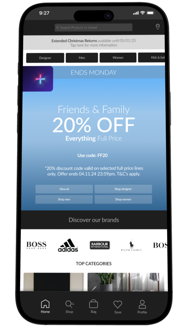
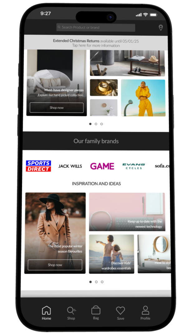
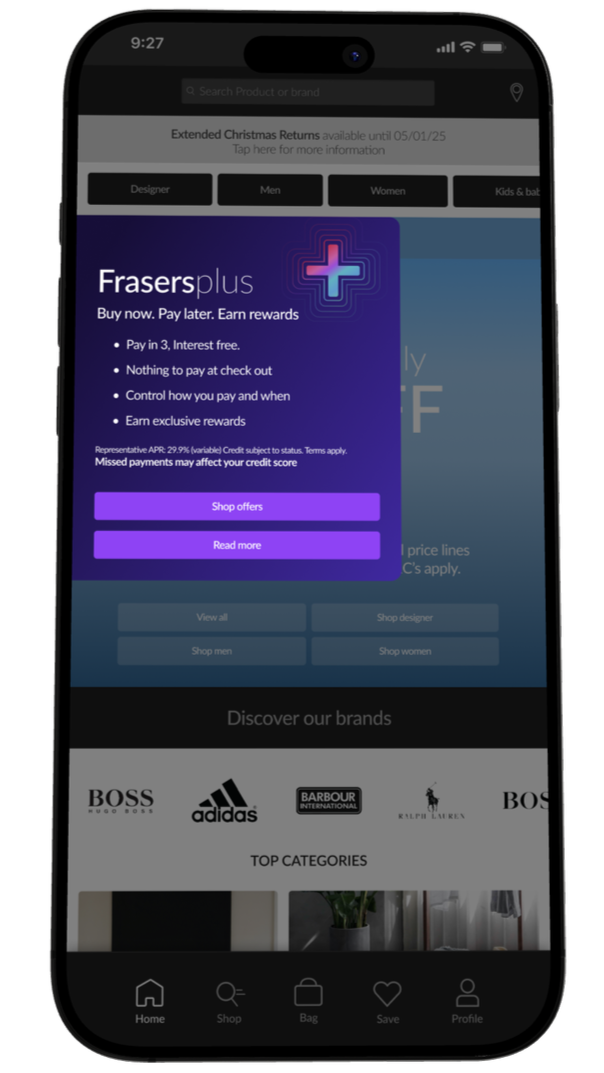
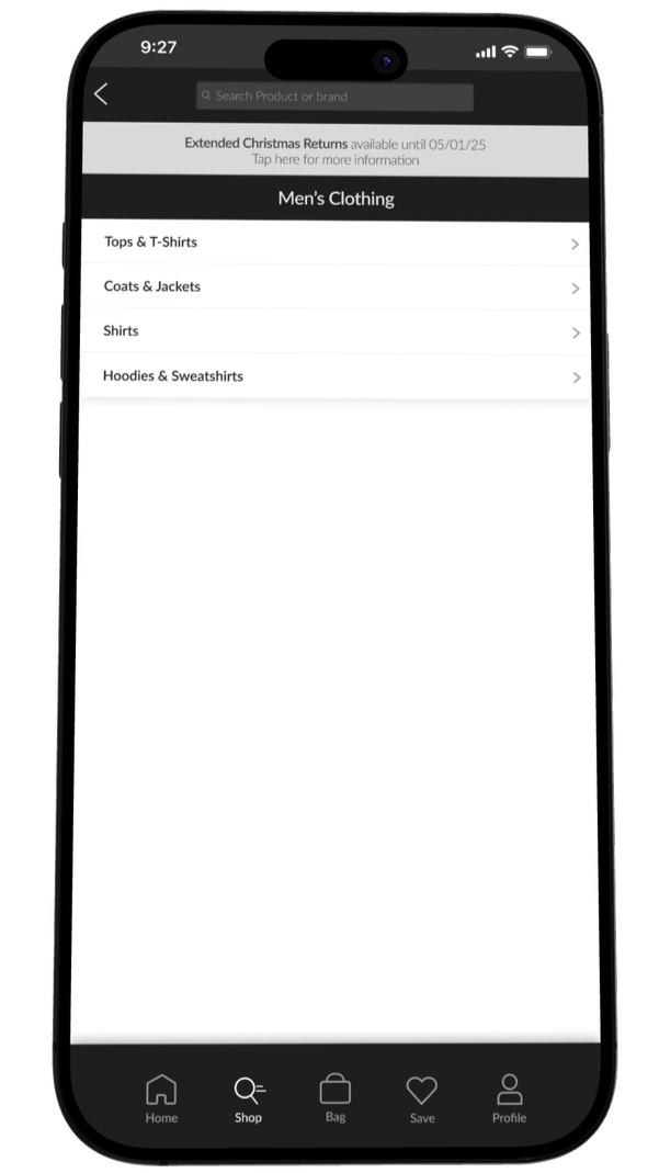
I overhauled the House of Fraser e-commerce design system to improve consistency, scalability, and speed of delivery. I rebuilt core UI elements using Figma, designed reusable components and libraries, aiming to make updates easier across teams. A key focus was clarifying and elevating House of Fraser’s credit offering, Pay Later and flexible payment options, ensuring these were clearly signposted without overwhelming the shopping experience. I simplified and cleaned up legacy UI patterns, improving visual hierarchy and accessibility across key journeys.
MY ROLE
LEAD DESIGNER
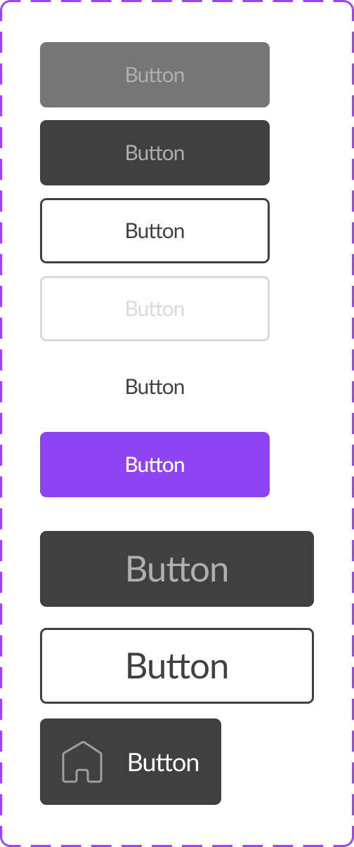
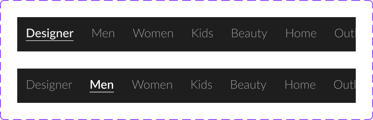
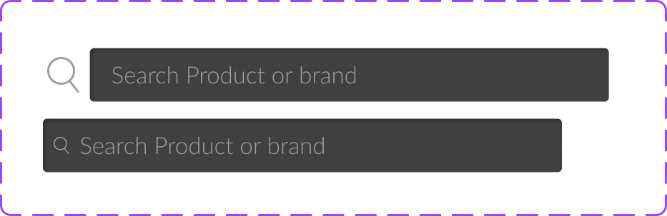
ATOMIC DESIGN
ICONOGRAPHY
PROTO-TYPING
COMPETITOR ANALYSIS
CONCEPT
E-COMMERCE
DESIGN SYSTEMS
ACCESSIBILITY

Project Focus
Improving hierarchy

Improving hierarchy across key templates (PDPs, PLP’s) presents an opportunity to guide user attention more deliberately. Small, pixel-level refinements can improve scannability drastically.
Conversion-based layouts

I wanted to refine “Pay Later” and credit options across PDPs. By being meticulous with spacing and component states, I wanted these messages to native rather than promotional add on’s.
Clearer design system

While reusable components improved speed, there was room to tighten visual consistency. A more rigorous approach to auto layout would ensure components worked well. This maintains a polished, premium feel.
Clearer CTA’s

Refining CTAs across the site to ensure they are visually consistent, unmistakable, and optimised for conversion.
SUMMARY
I led the creation of a design system for a new app build, employing atomic design principles to ensure a scalable and cohesive structure. The design system was developed to provide consistency across components and streamline future updates, focusing on reusability and clarity. This approach broke down complex UI into fundamental building blocks and maintaining brand integrity throughout the app experience. I chose to focus predominantly on the Home and Shop pages. This was concept work.
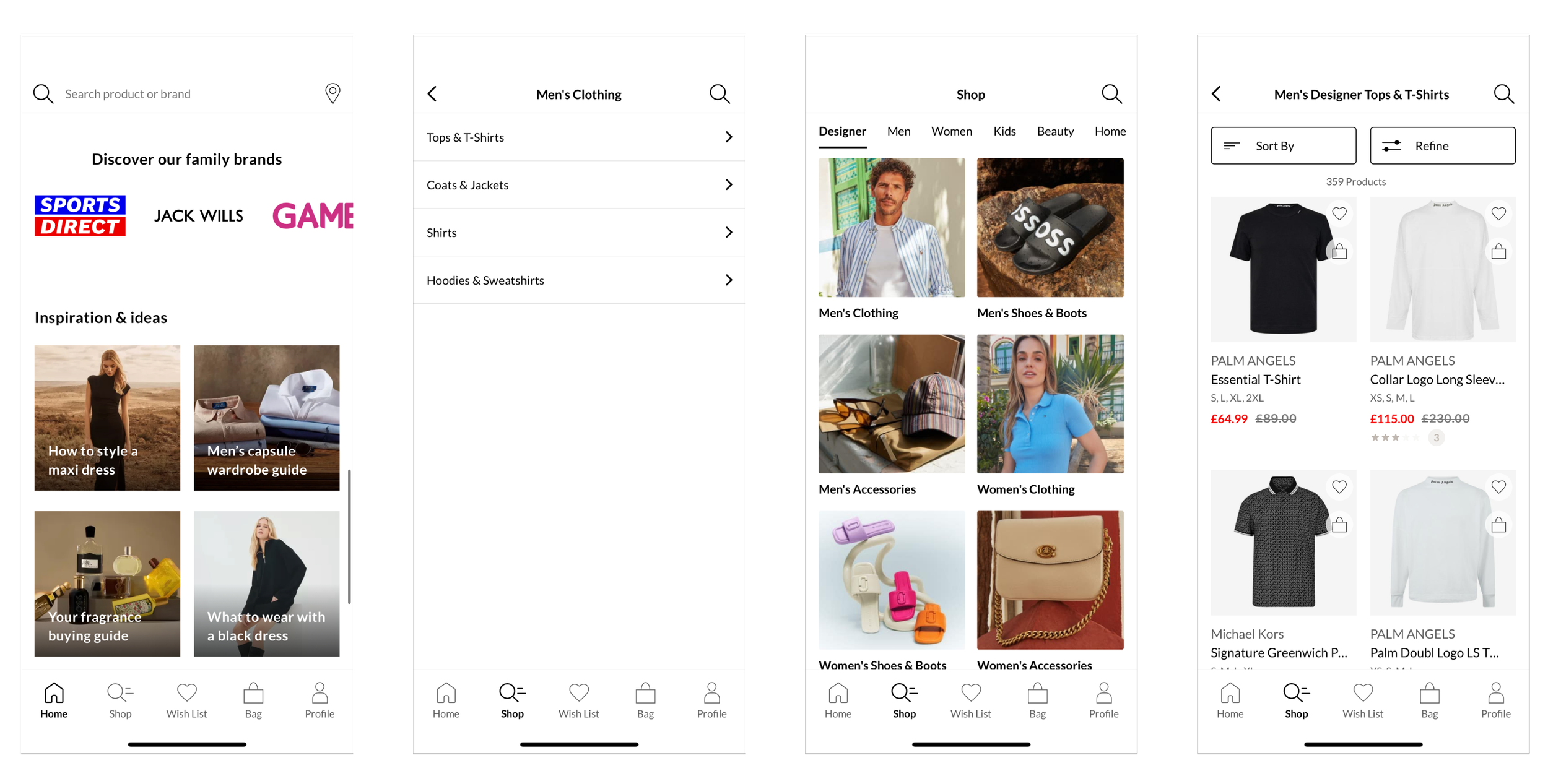
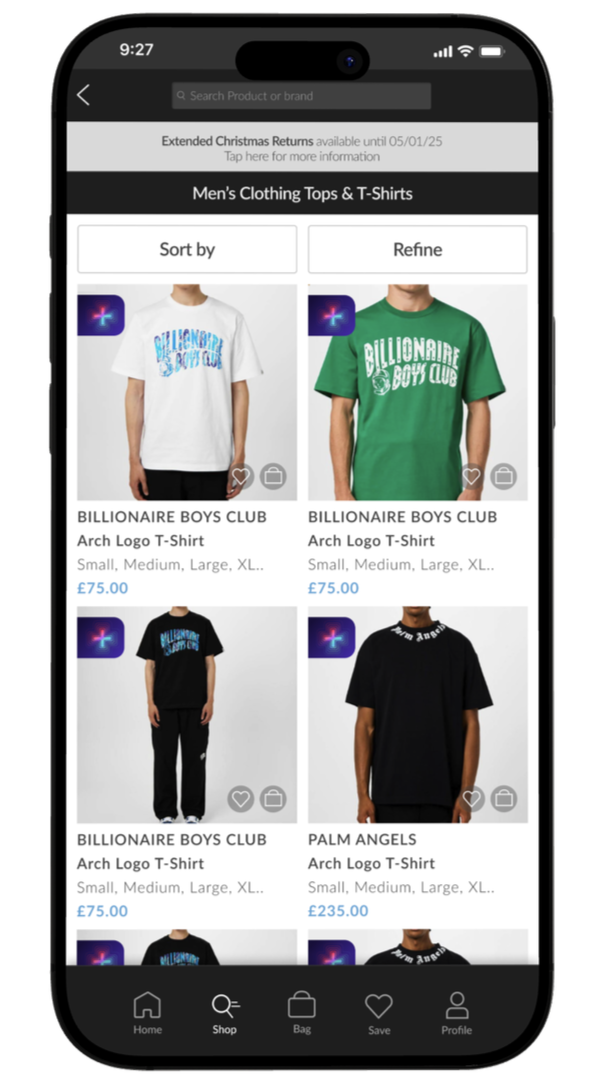
ORIGINAL SCREENS

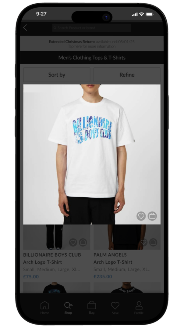
ATOMIC DESIGN (First draft)


Had I completed a QA it would have been detail-driven, ensuring nothing was lost between design and build. I would have delivered fully annotated Figma files with clear component states, spacing rules, and interaction behaviours defined meticulously (if you can avoid any extra meetings this helps significantly!). This would be supported by a checklist, accessibility requirements, and possibly edge-case scenarios to guide developers during implementation. I like to have walk-throughs at hand off to ensure there is no miscommunication. Post-build reviews would ensure the final output matched the design system intent, maintaining quality, consistency, and conversion focus across the digital product,
QA HANDOFF PROCESS
FINALS

Want to work together?
Let’s see what we can design :)